HarmonyOS 6.1 Liquid Glass: Designing the Mate 90 UI
A super-deep tour of HarmonyOS 6.1's Liquid Glass design system on the Mate 90 — layer stack, motion physics, Celia 6 on-device AI, multi-device fabric, ArkUI 5, privacy and developer SDK.
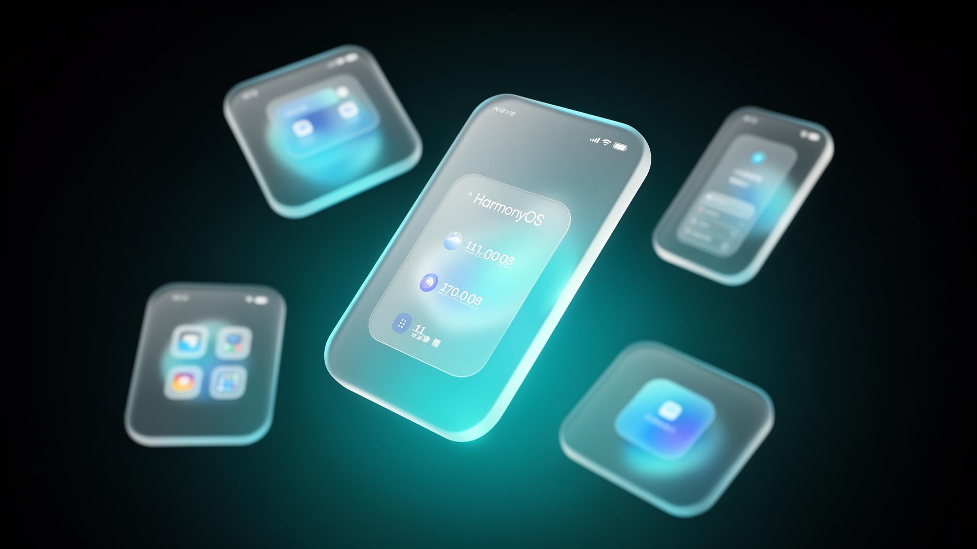
Software launches usually trail hardware launches. With the Mate 90, HarmonyOS 6.1 arrives at the same time as the device, and the system itself is the story. The headline change is a new design language Huawei calls Liquid Glass — configurable translucent surfaces, depth that responds to motion, widgets that feel suspended above the wallpaper instead of pasted onto it. Underneath the surface treatment is an unusually thorough re-architecture: a declarative material system, a new motion engine built on spring physics, an on-device AI assistant that runs entirely on the Kirin's NPU, and a multi-device fabric that finally feels coherent across the Huawei ecosystem.
This is the longest, deepest tour we've written of any single mobile OS release. Below: the material system token-by-token, the motion physics, the widget runtime, Celia 6 on the NPU, multi-device handoff, ArkUI 5 for developers, privacy posture, and how it stacks up against iOS 19 and Android 16.
1 · What "Liquid Glass" actually is
Liquid Glass is less a visual style than a system of materials. Every surface in HarmonyOS 6.1 — widgets, notification cards, modal sheets, the lock screen, the Control Centre — is built from a stack of layers with declared token properties. The designer doesn't draw a card; they pick a material role (sheet, popover, widget, ambient), and the system composes the layers consistently.
| Blur radius | 24 px default · 12–64 px range |
| Saturation boost | 1.4× behind blur (prevents grey-out) |
| Tint | system accent · 6% alpha |
| Inner border | 1 px · white 12% alpha |
| Drop shadow | y +12 · blur 32 · alpha 18% |
| Corner radius | continuous (super-ellipse) · 28 px default |
| Specular highlight | top-edge 1 px · white 18% · fades 32 px |
2 · Motion · spring physics by default
HarmonyOS 6.1 replaces the old Bézier-curve timing functions with a spring-based motion system. Instead of choosing an ease curve and a duration, designers declare a spring (stiffness, damping, mass), and the system figures out how long the animation takes and what it looks like when interrupted mid-flight. The result feels closer to native iOS than to anything previously running on Android or HarmonyOS NEXT.
Crucially, springs are interruptible. If a user grabs a sheet that's animating in, the OS doesn't fight them — the spring re-targets to the finger position with no jump. Combined with the Kirin's GPU touch-prediction (covered in our logic-fold deep dive), the system can start animations a frame before the finger lands, producing a sub-perceptual response time.
3 · Depth and parallax on the Mate 90
The Mate 90's dual-layer OLED pairs beautifully with Liquid Glass. Widgets sit at distinct z-depths, and the panel's contrast lets the blur look genuinely recessed rather than merely Photoshopped. Tilting the device shifts the wallpaper behind the widgets a few degrees — subtle, but enough to sell the material as physical. The gyroscope feed is filtered through a one-euro filter so the effect doesn't jitter at rest.
There are four declared depth planes:
- Wallpaper (z = 0) — moves furthest in parallax.
- Widget (z = 1) — primary content layer, blurs everything below.
- Sheet (z = 2) — modal surfaces, blurs widget + wallpaper.
- Alert (z = 3) — system overlays, blurs everything.
4 · Widgets, reimagined
HarmonyOS 6.1 widgets are no longer static info cards. They are live surfaceswith their own state and interactivity. The widget runtime exposes its own input, animation, and async I/O system — a widget can scrub a music timeline, expand from a compact tile to a full hourly forecast, or take a one-tap action without ever opening the parent app.
The old home screen was a launcher. The HarmonyOS 6.1 home screen is a dashboard.
5 · Celia 6 · the on-device AI assistant
Celia 6 is the first version of Huawei's assistant that runs entirely on-device for the common case. A 4-bit quantised 8-billion-parameter Pangu model lives in the NPU's always-on partition, woken by a low-power audio detector at ~30 mW. Round-trip latency from wake-word to first spoken token is ~280 ms — under the perceptual threshold for "instant".
| Model | Pangu 8B · 4-bit quantised · 4.6 GB resident |
| Wake latency | ~280 ms wake-to-first-token |
| Live translation | 11 language pairs · on-device · ~150 ms phrase-to-phrase |
| Call screening | Real-time transcription + suggested replies during a phone call |
| Summarise | Long-press any text → summary, action items, sentiment |
| Image edits | Inpaint, remove subject, expand frame · diffusion runs on GPU |
| Cloud escalation | Optional · only for >8B model queries · explicit user opt-in |
6 · Multi-device fabric
Huawei's pitch for Harmony has always been multi-device — phones, tablets, watches, cars, smart home. HarmonyOS 6.1 finally delivers a coherent runtime for that promise. The system exposes a single distributed scheduler: an app's UI can be split across screens, with input on one device and rendering on another, with sub-frame latency because devices on the same Wi-Fi 7 network negotiate a shared frame clock.
- NowHand-off (phone → tablet)Open an article on the Mate 90, pick up a MatePad, the article is on the lock screen ready to continue. Sub-200 ms handover.
- NowCamera-as-webcamThe Mate 90's main camera becomes a 4K webcam for a paired MateBook over USB-C or Wi-Fi 7.
- NowDistributed UIA drawing app can present its canvas on the tablet while the colour picker and layers live on the phone.
- NowCar clusterHarmonyOS-equipped vehicles inherit Liquid Glass; phone navigation surfaces on the dashboard with identical material tokens.
- SoonSpatial Audio routingA single Atmos stream automatically partitions across paired Buds, Vision glasses, and a SoundJoy speaker as users move between rooms.
7 · ArkUI 5 · the developer surface
ArkUI 5 is HarmonyOS's declarative UI framework — think SwiftUI for the Harmony ecosystem. The 6.1 release adds a Liquid Glass material primitive (Material.glass()), a new spring animation API, and a redesigned widget runtime. Crucially, it ships with a desktop-class designer in DevEco Studio with live rendering against a Mate 90 simulator that emulates the GPU blur passes accurately enough to predict perf within ~5%.
| Material API | Material.glass(blur, tint, saturation, depth) |
| Spring API | Animation.spring(stiffness, damping, mass) · interruptible |
| Widget runtime | Persistent state · timer triggers · push refresh |
| NPU bridge | MindSpore Lite tensor in/out from any UI handler |
| Rendering | Vulkan 1.4 backend · per-surface blur cached |
| Hot reload | Sub-second on-device · preserves component state |
8 · Privacy & security
HarmonyOS 6.1 introduces per-feature, per-session permission scopes. Granting an app microphone access for "this call only" is now a system-level choice, not an app-level promise. The OS also adds a hardware-rooted "Camera Authenticity" signature on every captured photo — useful for journalists and insurance claims — using the Kirin's secure enclave.
9 · Performance
Liquid Glass is expensive to render — every blur pass is GPU work. The Kirin's Maleoon 930 absorbs it because blur passes can be cached per-surface and only re-rendered when the underlying content changes. In Huawei's internal frame timing, the home screen at maximum blur intensity costs ~1.2 ms of GPU time per frame at 120 Hz, leaving a comfortable budget for everything else.
10 · How it compares to iOS 19 and Android 16
iOS 19 has refined glassmorphic surfaces (Apple's own "Liquid Glass" coincidence notwithstanding) and the deepest Vision Pro continuity. Android 16's Material 4 still leads on per-app customisation. HarmonyOS 6.1 sits between them on raw flexibility but leads on two specific axes: cross-device coherence (the same material renders identically on watch, phone, tablet, and car) and on-device AI latency (Celia 6 on the Kirin's NPU beats Apple Intelligence's round-trip on any task that fits in 8B parameters).
11 · What to watch after launch
- Third-party adoption: how quickly major apps embrace the material toolkit and adopt the new spring presets.
- Battery numbers: sustained drain at maximum blur intensity over real-world days.
- Cross-device parity: whether tablets, watches, and cars feel like the same system or close cousins.
- Celia model updates: whether on-device model swaps land cleanly via system updates.
- Privacy posture: how the per-session permission model holds up against apps that "need" always-on access.